 One of the best blogs out there for e-publishing is The Book Designer, where Joel Friedlander dispenses advice on making self-published and indie-published work look as good as it can. So I was excited when I read that he had a monthly contest for book covers. Every book has a cover, but so many of the e-books I’ve seen look, imho, completely amateurish, with poor font choices, muddled or cliche design, cockeyed proportions between elements, and empty space you could drive a donkey cart through. A lot of them wouldn’t have worked for a Ladies League Cookbook.
But putting those impressions into words is beyond me. I thought hearing from a professional like Joel about both my own cover and those of other e-books would be very educational.
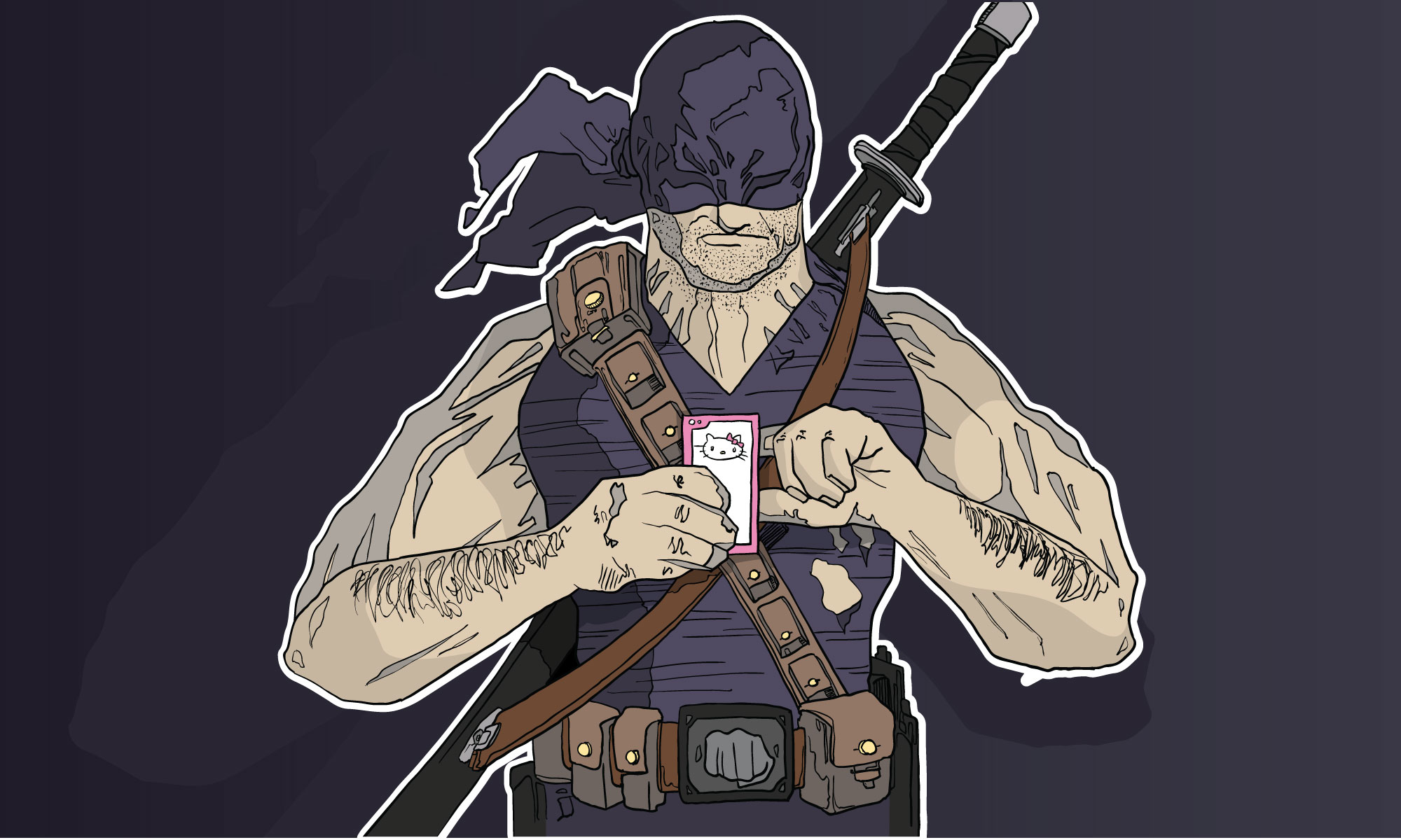
And hey, frankly I thought we might win the contest. But alas, not this time. Joel had mostly positive things to say about the cover, designed by Airan Wright.
This cover has some of the most sophisticated typography of all the covers this month, and professional-quality illustration. What held it back, in my view, was the difficulty making out what exactly the illustration is, and what meaning it has. Also, having so many strong elements on one cover has led to a bit of graphic confusion.
Well, he’s probably right about the graphic confusion. We’ve talked a little bit about changing the cover in the future, taking out the starburst at the trapeze, and inserting a hand and forearm. But it’s pretty nice to hear that we have “the most sophisticated typography” of the month. I know what I like, and I liked Airan’s work right away. It’s grabby, and it’s going to work for other books in the series.
Among all the choices a self-publisher must make, one of the most important is what to do yourself and what to hire out. This requires deciding what you’re good at, and frankly that can be difficult. But you don’t get a second chance to make a first impression. A strong cover is important, and will be increasingly crucial as more color tablets enter the market and people use them to browse for their next read. I learned a long time ago that while I may have an EYE for design, that doesn’t mean I can actually DESIGN something that will attract other people.
Friedlander’s website, and especially the contest, is something every self-publisher should check frequently. You can’t judge a book by its cover, except most of the time.